PROJECT OVERVIEW

REDESIGNED TOOL
SOLUTION
Rapid Music Alignment
Shortening Add Measure Process
Feedback from peers found that adding measure button was far. Making it a hover button that corresponded to the measure was easier.
Based on user testing, users thought the button would add a measure into the sheet music.
1
Bounding box measures only
Generated corresponding bounding boxes on measure and soundwave.
Suggestions from peers point out the redundancy of having to generate boxes twice.
Also allowed our application to run faster, decreasing alignment process times.
2
Displaying only sheet music
At first, including soundwave of recorded performance alongside measures to allow user to visually see alignment easier.
User tests with musicians found the soundwave visualization encouraged high granular accuracy in alignment.
Peer feedback suggested removing soundwave to return to measure granularity.
3
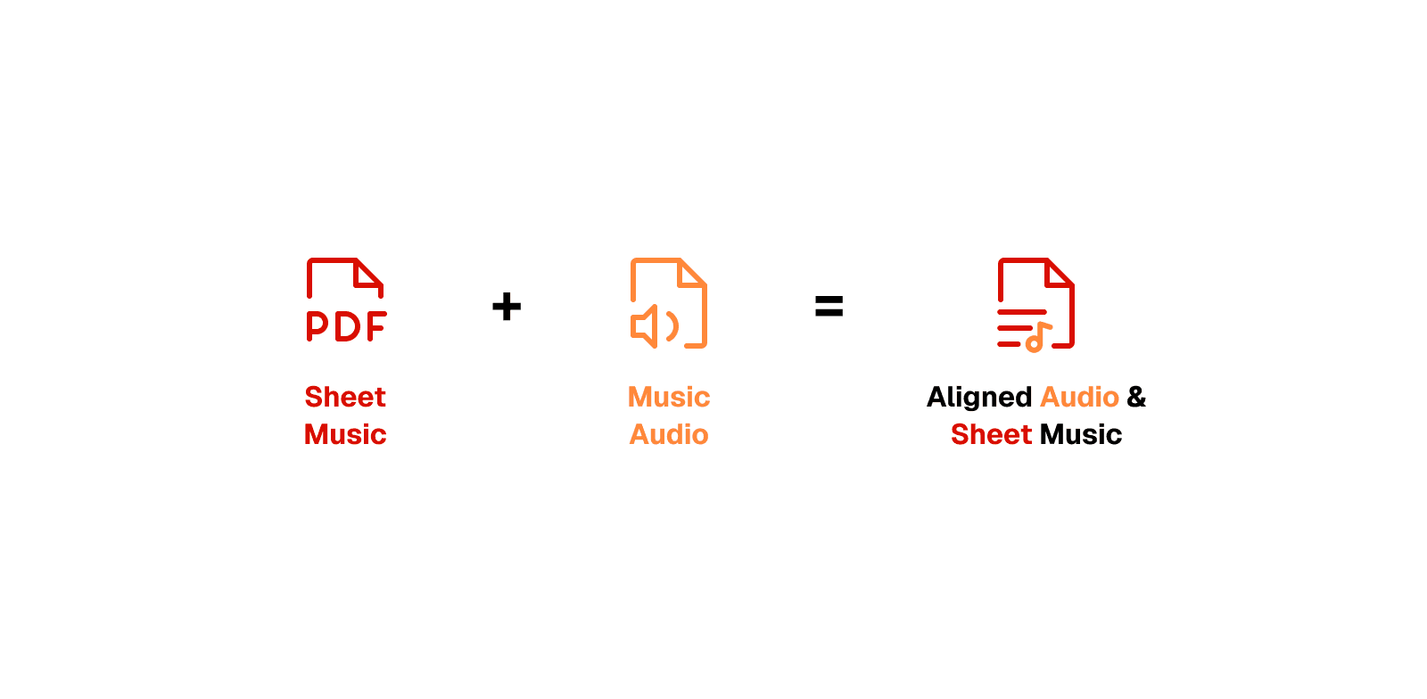
How might we quickly generate aligned data for researchers?
MOTIVATION
The Proof of Concept
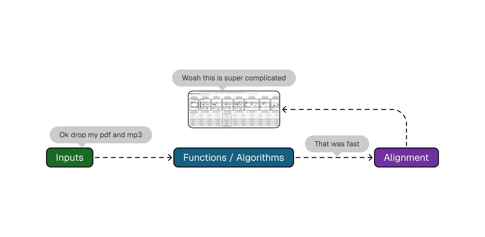
Speaking with researchers, our team learned how researchers currently align their sheet music and audio with a tool they developed in-house.

We learned that while researchers could accomplish their task of aligning pdfs and mp3 files, they were experiencing high friction in their processing of that data. Looking at the tool they built themselves, it was clear that the interface was built purely for function.
We learned that researchers using this tool took 20 hours to align only 13 pieces.
Under the Hood

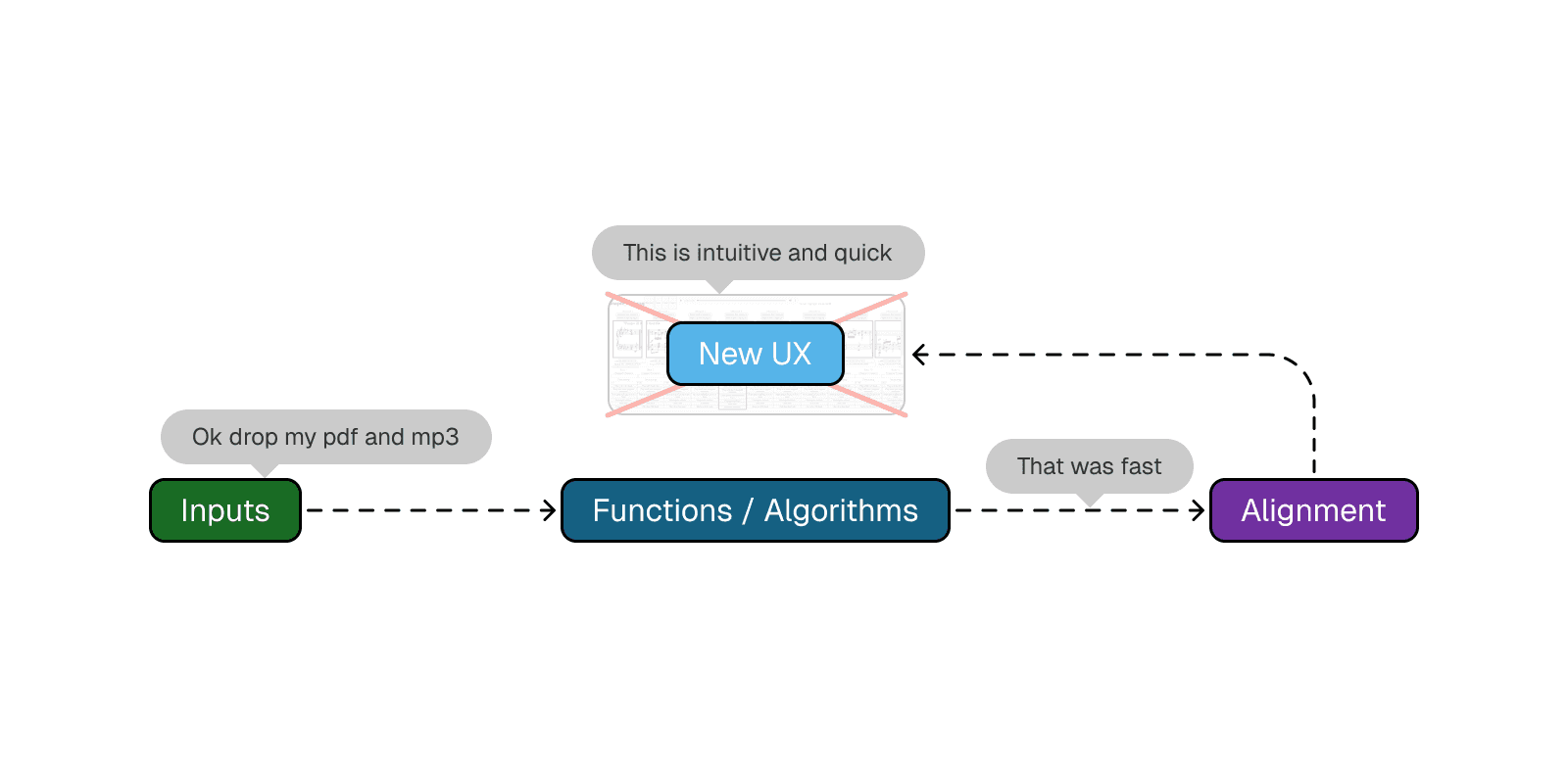
Reading the above papers and speaking with researchers, this is the general mechanism. Green are the inputs, the blue indicates functions that occur in the system, and purple is the aligned data as output.

13 Pieces -> 20 Hours to Align
The processes that are running in the tool to align mp3 and pdf files are the fastest in the industry. However, we recognize that design of the tool itself is bottleneck on user performance.
High Friction within the Experience
As mentioned previously, a quick glance at the tool indicates minimal considerations into the design of the tool and a prioritization in functionality as a proof of concept.
What our team set out to do:

Examining under the hood and diagnosing the current interface as the issue, we set out to design a more intuitive experience for researchers.
RESEARCH
Competition had NO alignment feature or was not the intended goal
Despite our clients claim that there were no competitors, our team conducted an analysis to verify this claim. Of the 6 competitors we found, there was indeed no automatic alignment service provided or alignment did occur, but was never the intended goal of the application.

User Interviews
From research there was a huge gap of aligned data and lack of a service that aligned sheet music and audio, my team interviewed musicians our client was working with at the CMU School of Music.
RESEARCH QUESTIONS:
Could you walk us through your practice routine?
How can you tell that you are improving?
Have you tried recording yourself and playing it back?
Are there any resources or tools you used?

Reach out to me to learn more about this project and my process!
CONCLUSION AND LESSONS LEARNED
What I would do differently next time
As someone that used to study music and have some exposure to AI / ML, this project was an interesting intersection of the two domains. Not only am I immensely proud of my team’s output, but also for the opportunity of working with our client who operates specifically within this space of music and generative AI. Some takeaways I got:
No such thing as too many iterations. In the beginning stages, our team explored so many different options to try finding the right solution for musicians. Our team drew up several iterations and from there we branched out designing 4 iterations to ensure that every aspect within the application was crafted with intention.
Tradeoffs are always present. An example I can think of was early in the project when we still had audio waves being shown in our early iterations. Showing the changes and really communicating what that means for the user helped not only my team members but our advisors and client understand the rationale behind certain design decisions. I hope to continue this practice and develop this skill in future projects.
Be insight driven. This case study lived on a google document for quite a while, before eventually being published here. That document was about 14 pages long, filled with unnecessary text that didn’t answer the question: “how does this fit into the bigger picture?”. The following iterations of the case study involved a significant culling (about 60%) of content and focusing mainly on the major points throughout the project. Storytelling is an ability that I am still grappling with and by honing in on the insights and influential points, I can create more cohesive narratives.
The exchanges that occurred was incredibly valuable; our client was able to create an application that is not only beneficial to their research but to the general music generative AI community and our team was able to employ the entire UX process while learning best practices in designing with AI / ML in mind. In the end, I believe that I pushed for the application to it’s best state and made sure to not let my own thinking stop me from questioning whether a decision was truly best for the user.
For work inquiries or to chat with me, email me at anthonywudesign@gmail.com
Thanks for reading~


